It looks good, but feels generic.
Without a clear point of view, the property can blend in with other well-styled rentals.
Your rental can look polished and still feel like one more listing.
StayIQ turns what is distinctive about the property into a clear name, visual identity and practical brand system that can carry from the listing into the guest experience.
Good photos can earn a second look. A clear identity helps guests understand what makes the property different—and remember it later.
Without a clear point of view, the property can blend in with other well-styled rentals.
If the identity is unclear, the property is harder to recall, recommend and search for again.
The listing, welcome materials and on-property touchpoints may all look and sound different.
One connected package defines the property identity, then shows how that identity can be applied where guests actually experience it.
The work is organized so the owner can understand the identity, use it correctly and carry it into the right guest touchpoints.
A focused brief that captures what makes the property distinct and who it should speak to.
Naming support when needed, plus one primary logo and one simplified mark.
Color, typography and voice choices that give the property a consistent point of view.
A practical reference for using the identity with greater consistency.
Final approved assets prepared for common digital uses.
Clear direction for the next brand and activation priorities.
This example shows how StayIQ can uncover what makes a property distinctive, give it a memorable name and identity, and carry that identity into practical guest-facing touchpoints.
Original listing title
The property may be attractive, but the title and presentation could describe hundreds of other rentals. Guests have no clear name to remember, no story to repeat and no connected identity across the stay.
Come In. Slow Down. Look Up.
A quiet, elevated place to reconnect beneath the mountain sky. The new identity combines an upright juniper branch, a small gold star, warm cream, forest green and restrained gold detailing.
Branded listing treatment
The name, promise and property features now work together, giving guests a clearer reason to remember and describe the stay.
These examples illustrate possible activation directions. They do not mean every physical item is automatically included in the package.
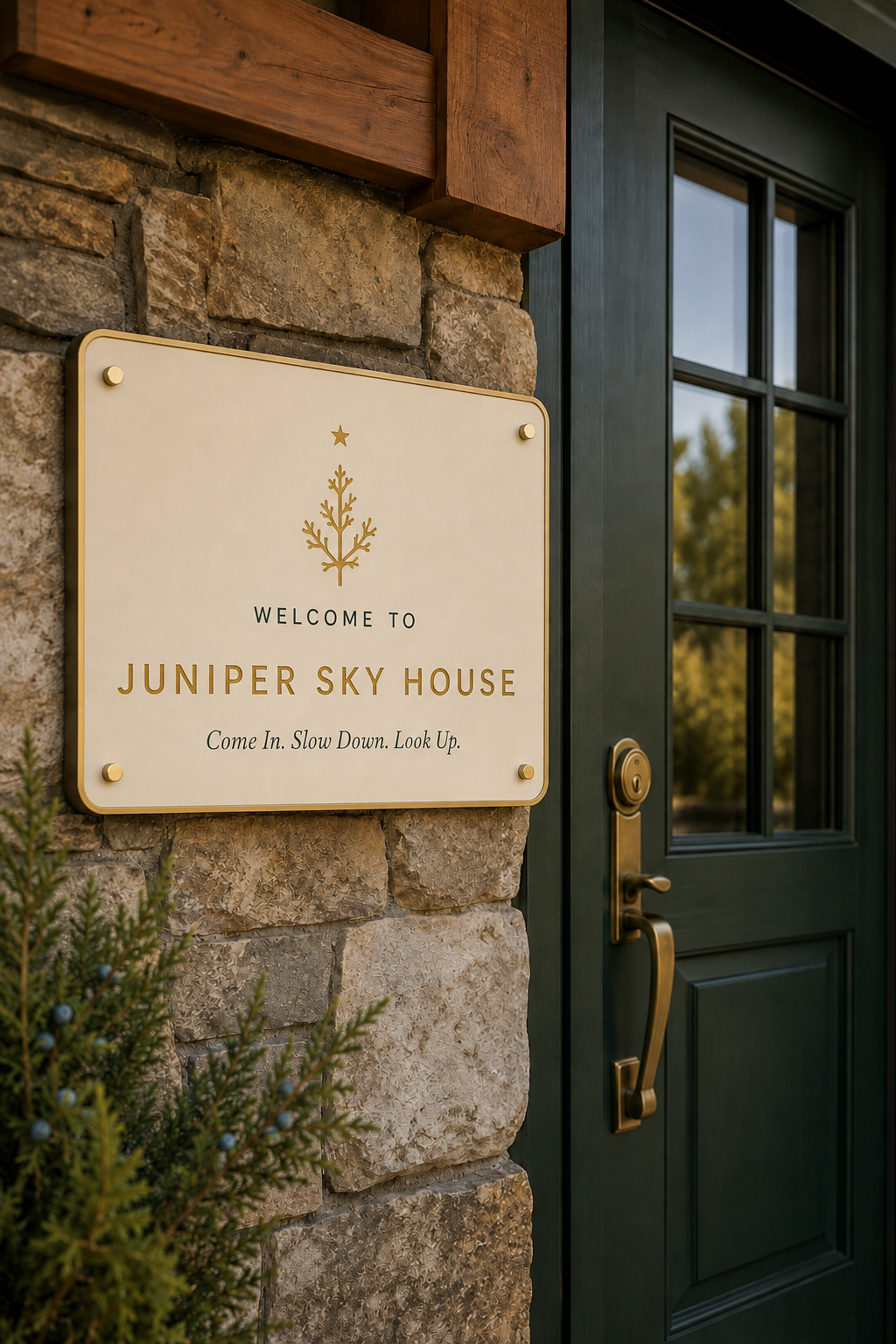
The name, locked logo and tagline turn arrival into a clear first impression.
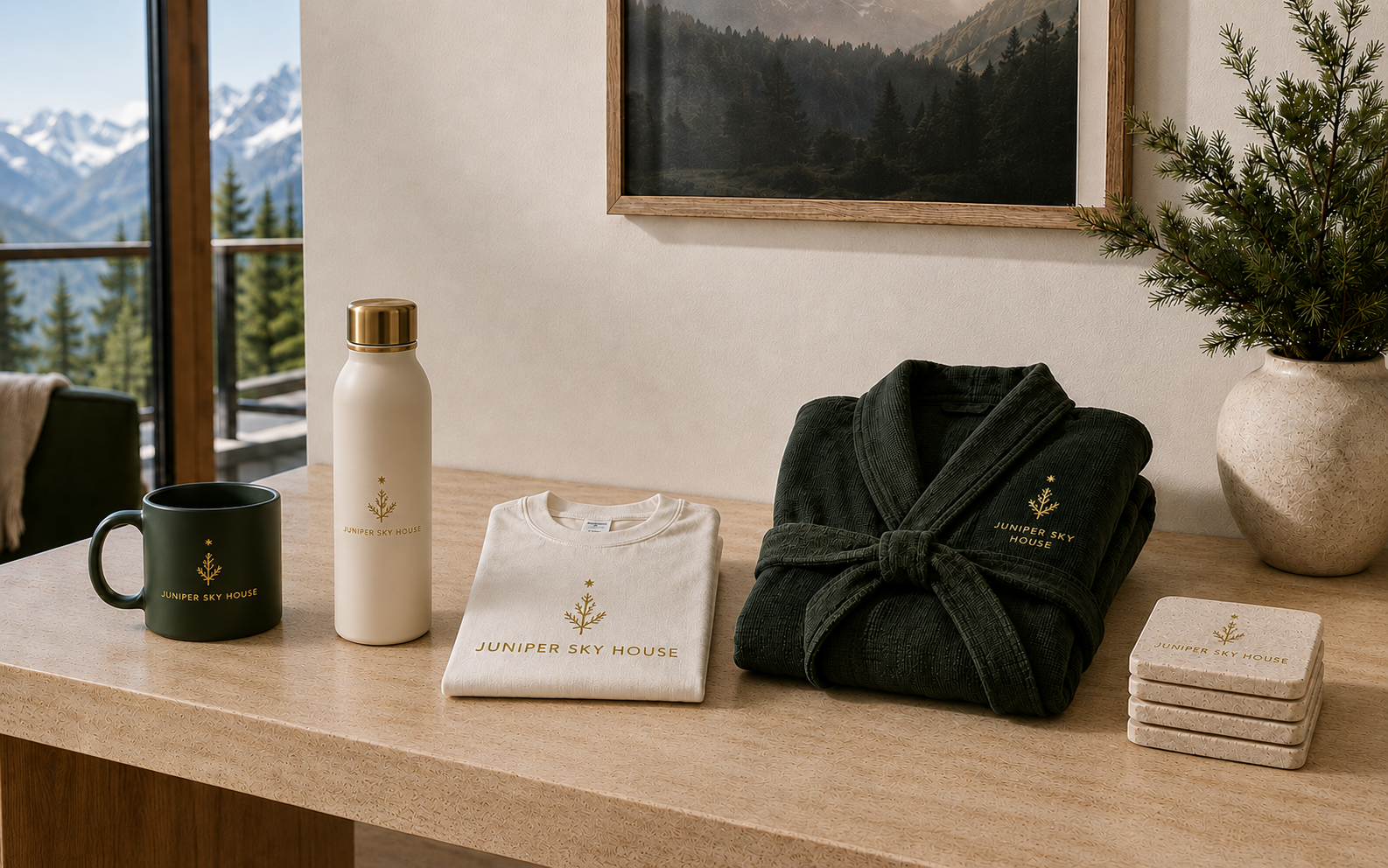
A mug, water bottle, T-shirt, robe and coasters demonstrate how the same identity can extend without changing from product to product.
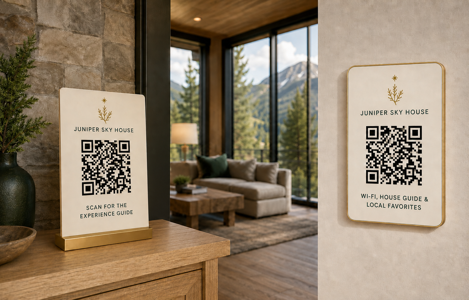
A tabletop Experience Guide display and wall plaque for Wi-Fi, the house guide and local favorites give every code a clear reason to scan.
Case-study QR codes are visual demonstrations. Any production QR code would be replaced with a real, tested destination before client delivery.
A connected engagement that defines the property identity and prepares the approved brand assets, guidance and selected activation directions needed to use it consistently.
Physical products, printing, fabrication, shipping and outside vendor costs are separate from the $399 package price.
We begin with the property, its guests, its setting and what makes the stay different.
When naming is needed, we explore up to 3 directions, then develop the chosen visual direction.
We create the logo system, color, typography and voice direction, with up to 2 revision rounds after direction selection.
We identify up to 5 opportunities and prepare direction for up to 3 selected standard touchpoints.
You receive the approved web-ready assets, practical use guidance and clear Action Paths™.
The package is especially useful when the property itself is strong, but the identity is generic, inconsistent or unfinished.
A beautiful property that still feels like another listing
A new or repositioned property that needs a clear name and identity
An existing property with inconsistent visuals or guest-facing materials
An owner who wants the listing and on-property experience to feel connected
These items may be explored separately after the core identity and activation priorities are clear.
Brand direction for selected guest-facing signs, markers or QR plaques.
Selected cards, inserts or other useful arrival materials.
Appropriate merchandise or products that support the property experience.
Handoff direction for approved physical items produced by an outside vendor.
Fabrication, printing, shipping, merchandise purchases and outside vendor costs are separate from the core package.
The package creates and activates the property identity within the approved scope. It does not include every form of production or property improvement.
The Free Property Opportunity Audit helps identify what is clear, what may be missing and where a stronger identity could support the property.